[Collaborative] UI/UX Design
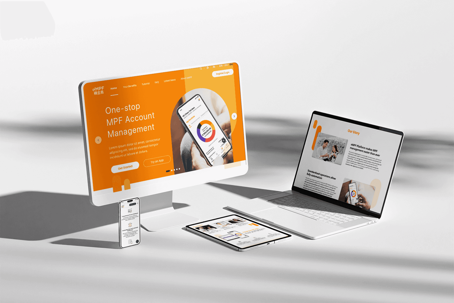
eMPF Portal

Project Overview
Embarking on a revolutionary path in pension management, the eMPF platform emerges as a pioneer of innovation and accessibility within Hong Kong's financial sphere. This all-encompassing, fully digital platform reimagines MPF management, setting new standards for efficiency, precision, and dependability. Tailored to cater to the needs of over 4.7 Million employees, 360,000 employers, self-employed individuals, and MPF intermediaries, the eMPF Platform streamlines the complexities of MPF account management, heralding a modern era characterized by smooth, instantaneous, and secure interactions.
Accessibility and Multi-Platform Reach
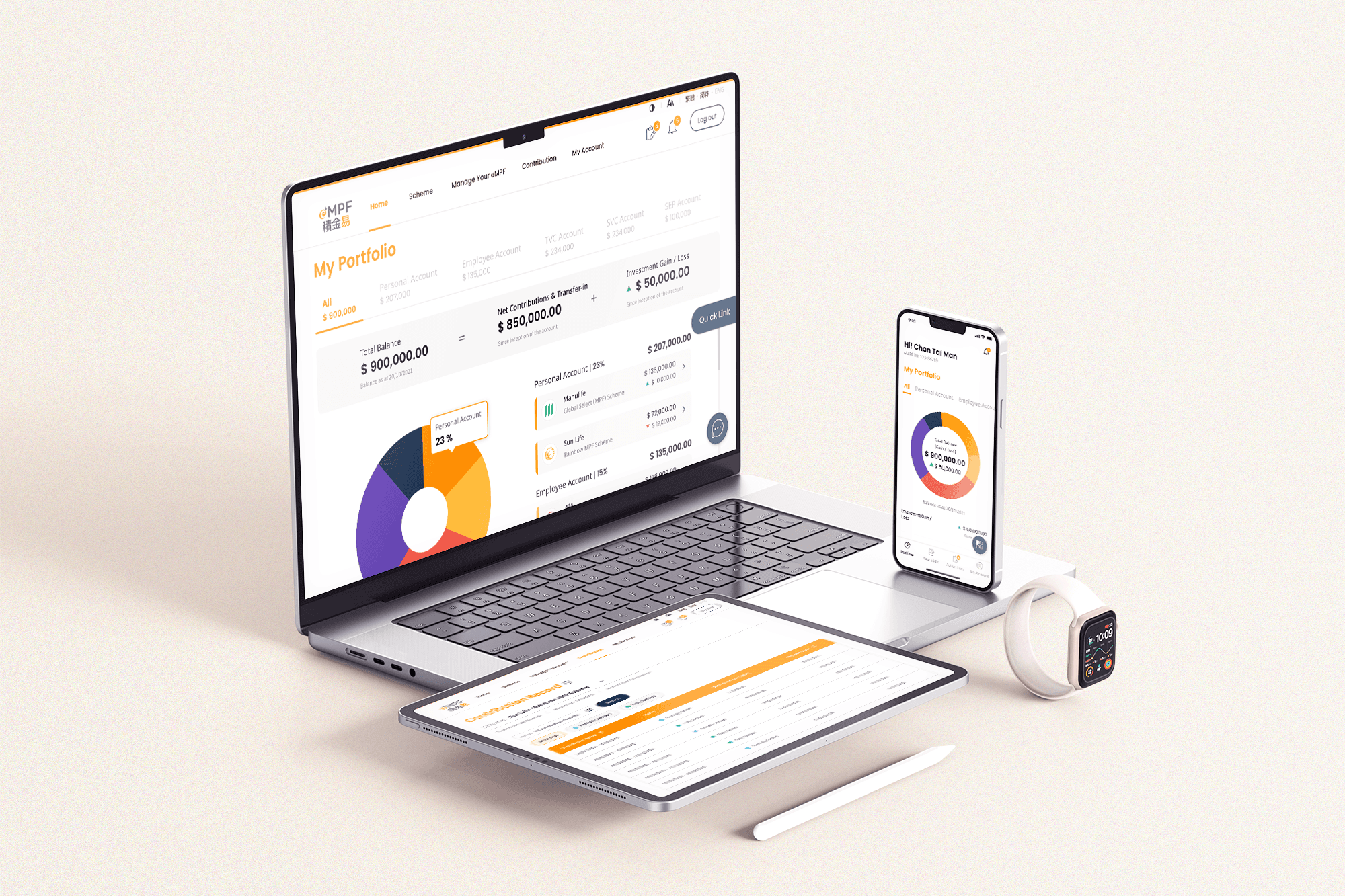
The eMPF platform extends its reach seamlessly through mobile apps, responsive websites, and conveniently located kiosks, providing users with the flexibility to manage their MPF accounts anytime and anywhere. For those without electronic devices, especially older individuals, dedicated kiosks at service centers offer an accessible avenue to engage with the platform. This multifaceted approach ensures that the eMPF experience is inclusive, catering to diverse user preferences and needs.
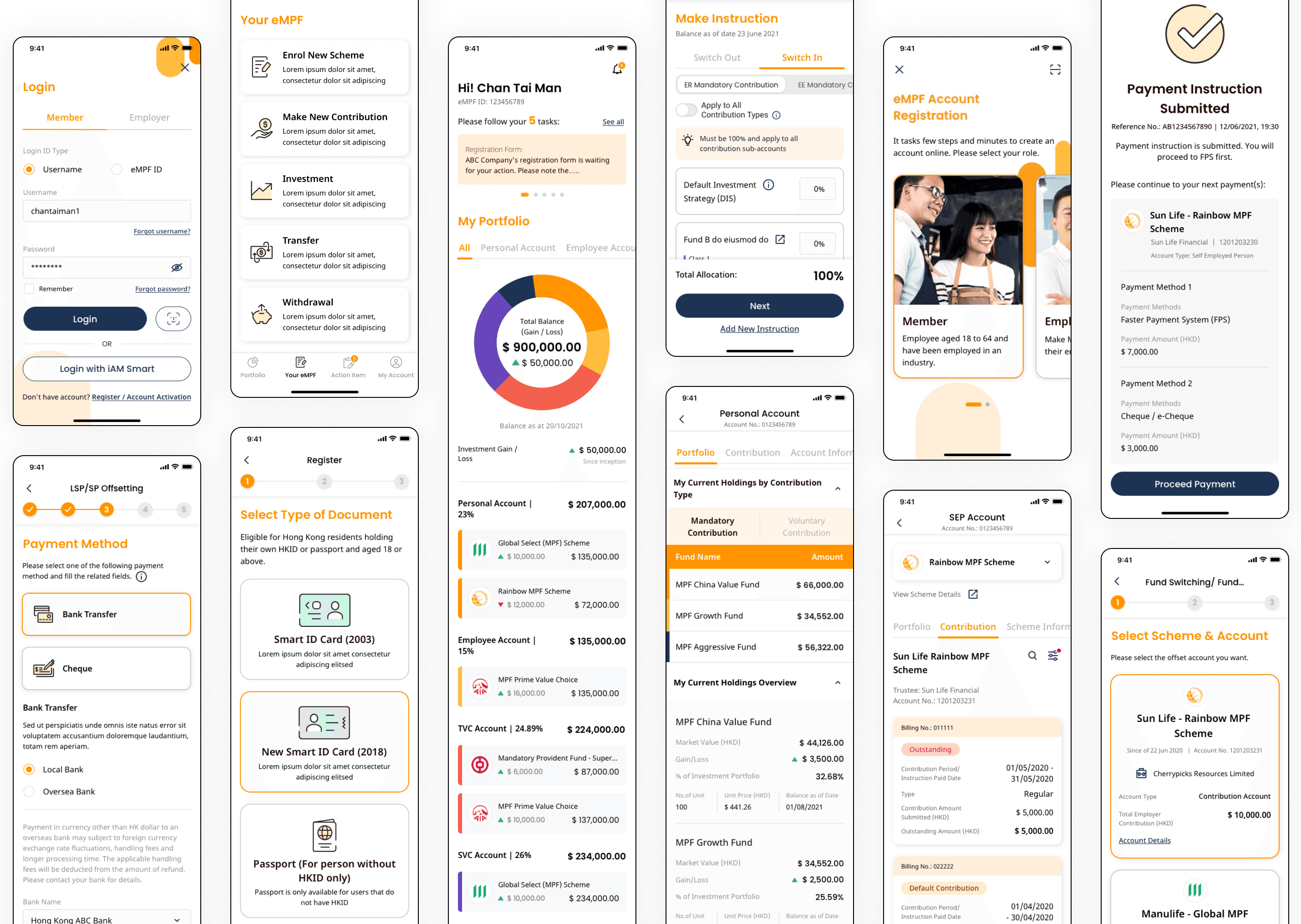
Mobile App Integration
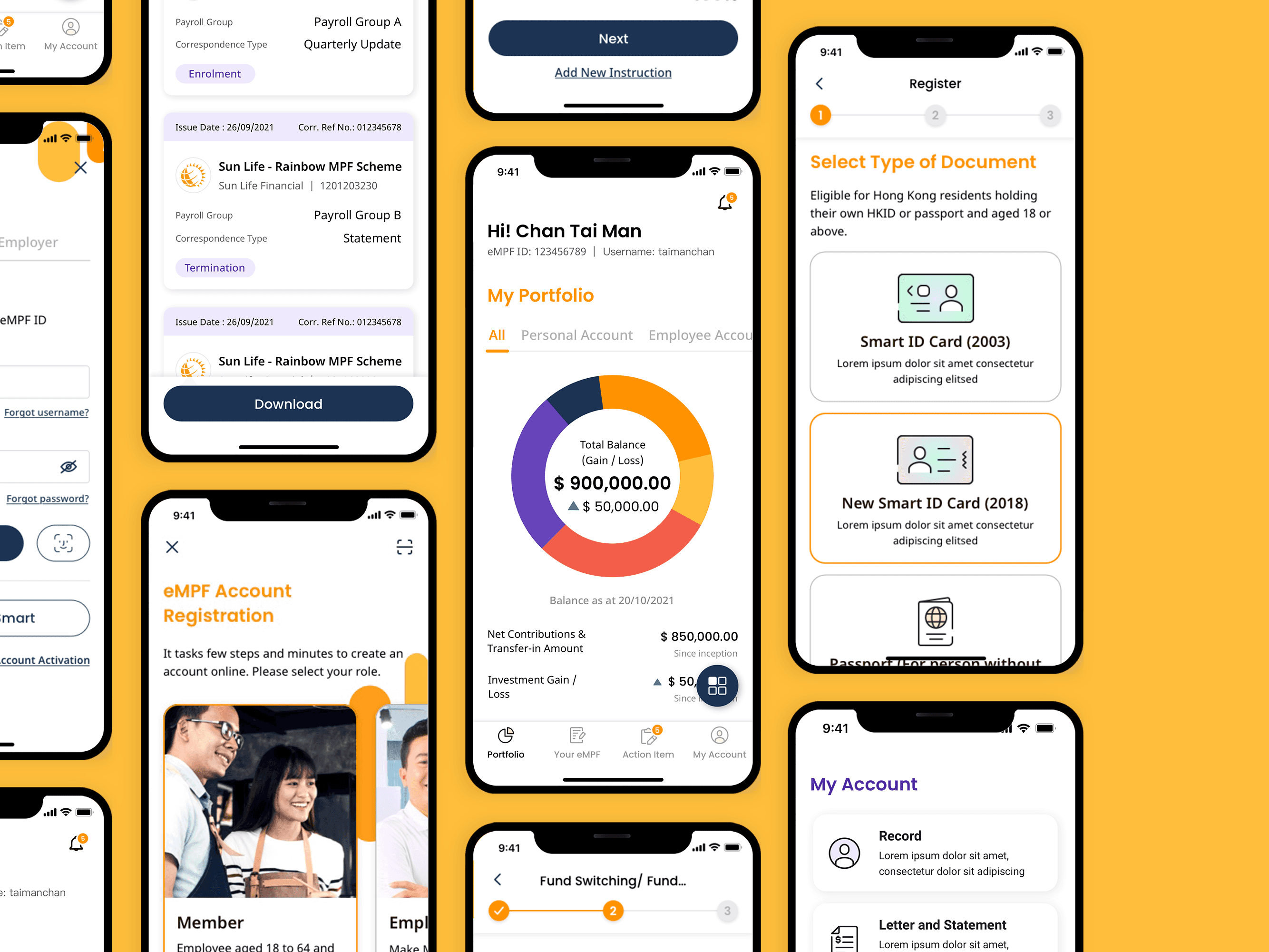
Empowering users with unparalleled convenience, the eMPF mobile app integrates all website functions into a user-friendly interface. Providing a streamlined experience, the app facilitates essential processes like enrollment, investment, and contributions, simplifying intricate tables and forms found on the website. The design emphasizes clarity and user-friendliness, presenting information in a format optimized for mobile devices. Furthermore, the mobile app integrates eKYC verification, fortifying security and user authentication processes.
Design Guidelines and Accessibility
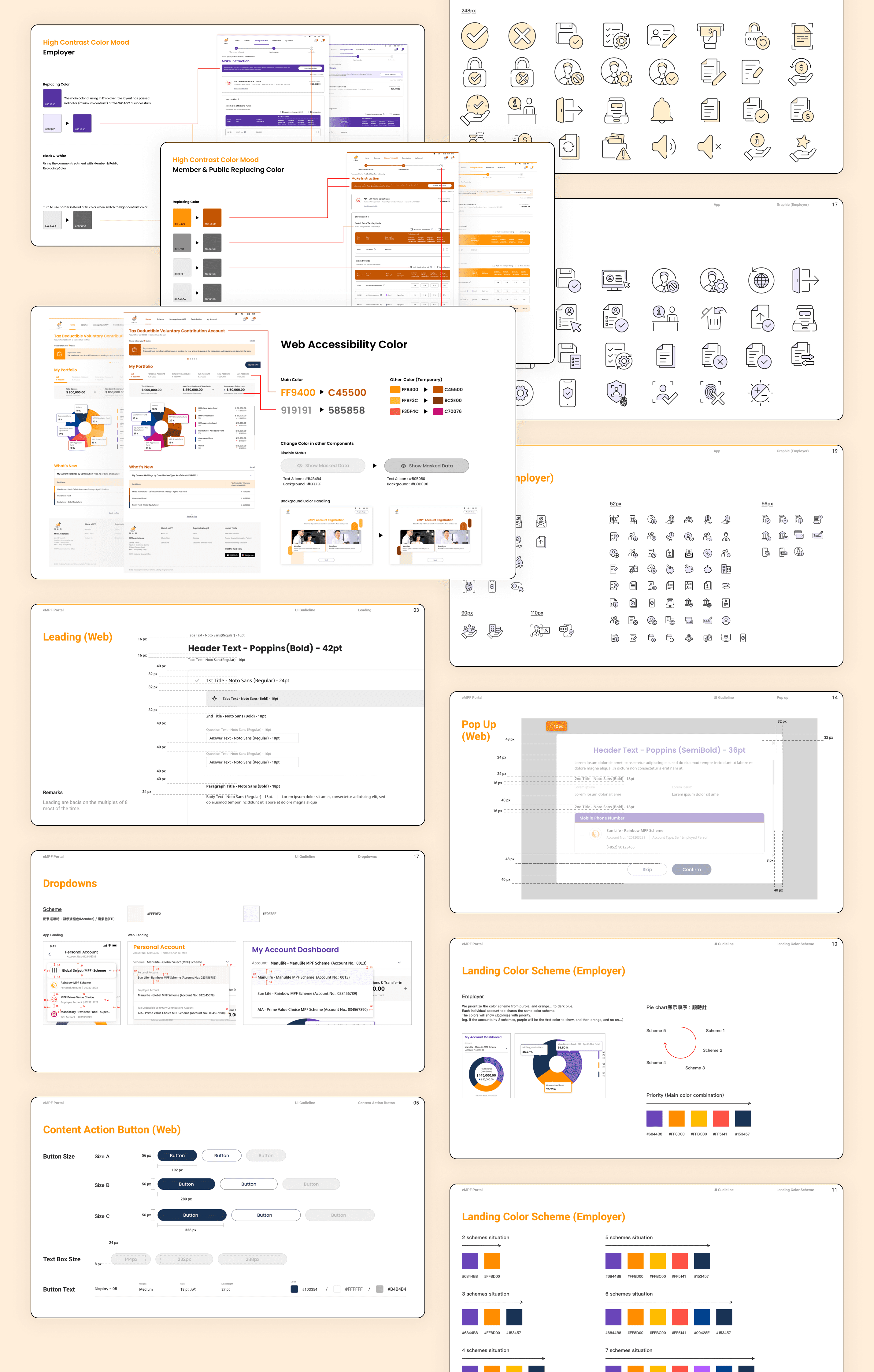
We have developed a comprehensive design system for this project, encompassing web, app, and kiosk interfaces. This system defines typography, font size, button size for different scenarios, padding, and spacing. Colors for pie charts are specified separately for both employers and employees. An iconography design file consolidates all icons and graphics used across the employee, employer, and kiosk portals. These guidelines provide clear directions for developers and offer insights for clients. Additionally, we created an accessibility guideline to ensure the project meets WGCA 2.0 standards, specifying color codes for accessibility mode.
Employee Experience
For the employee role, we chose orange as the main color scheme to convey the innovative, bright, uplifting energy of the project. Orange is also attention-grabbing, aligning with the main color code of our client, the MPFA. This distinction helps users easily identify the employee interface.
The employee platform encompasses 18 modules, including enrollment, transfer, withdrawal, contribution, and investment. Simplifying and consolidating complex forms and tables into clear, user-friendly interfaces was a key challenge in this design.


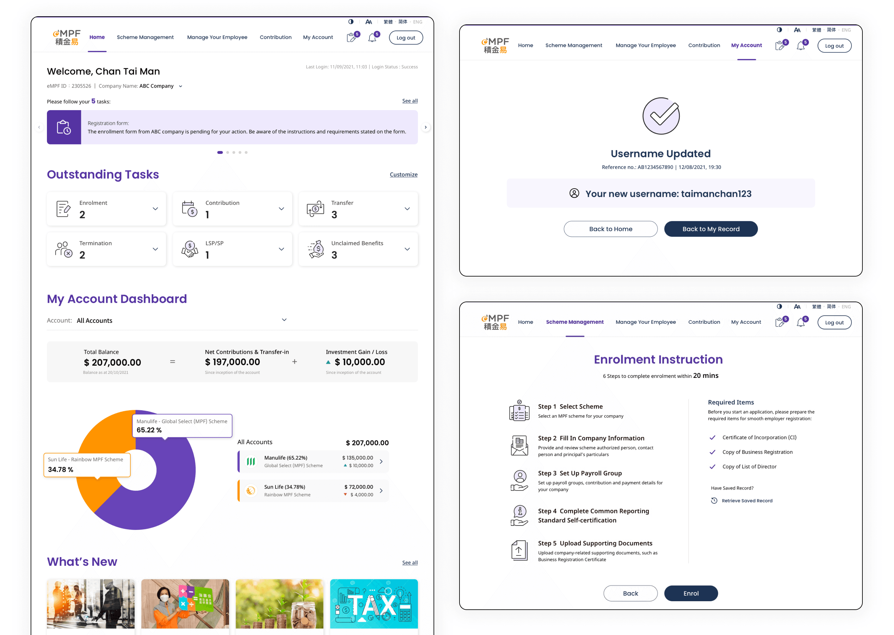
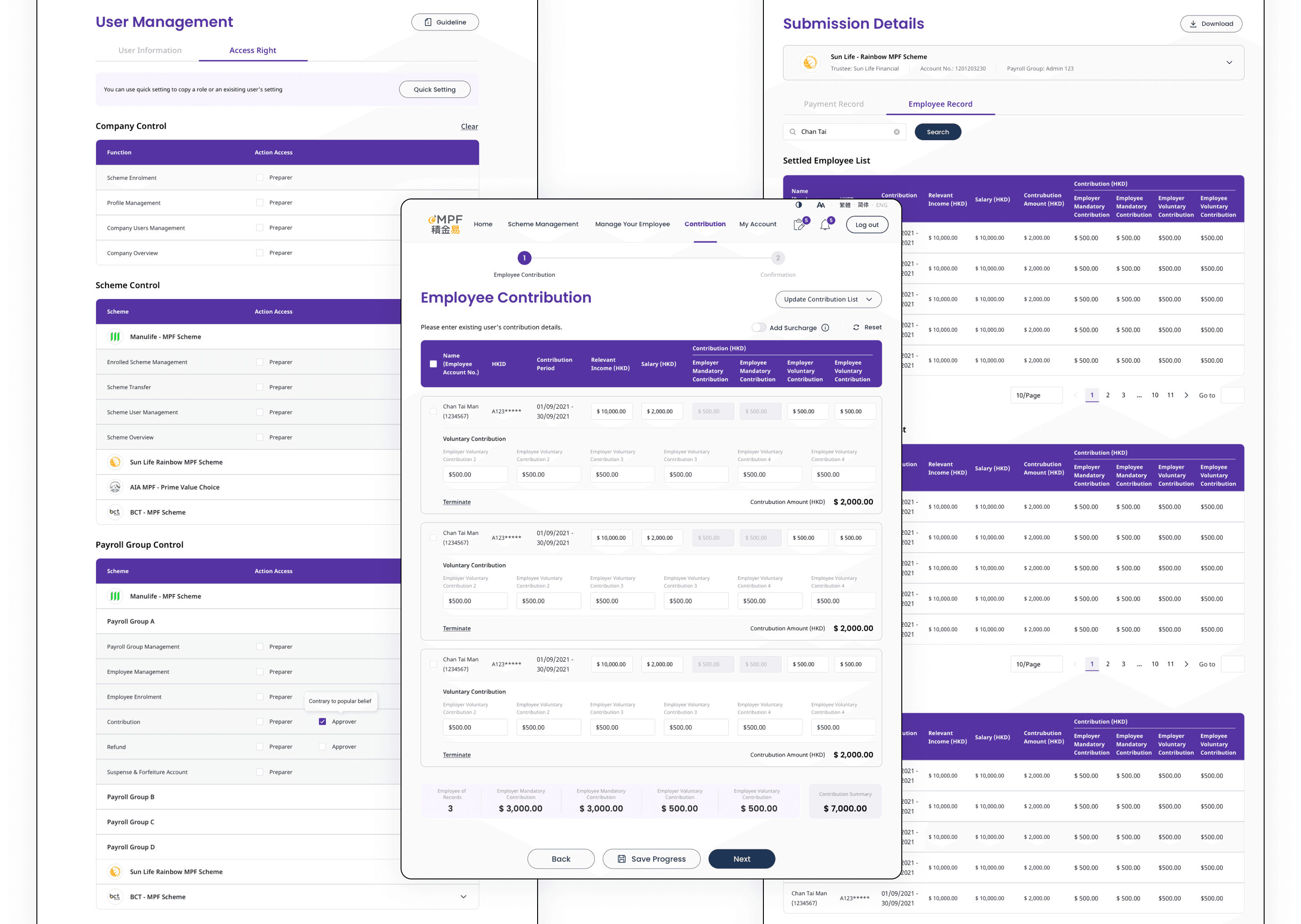
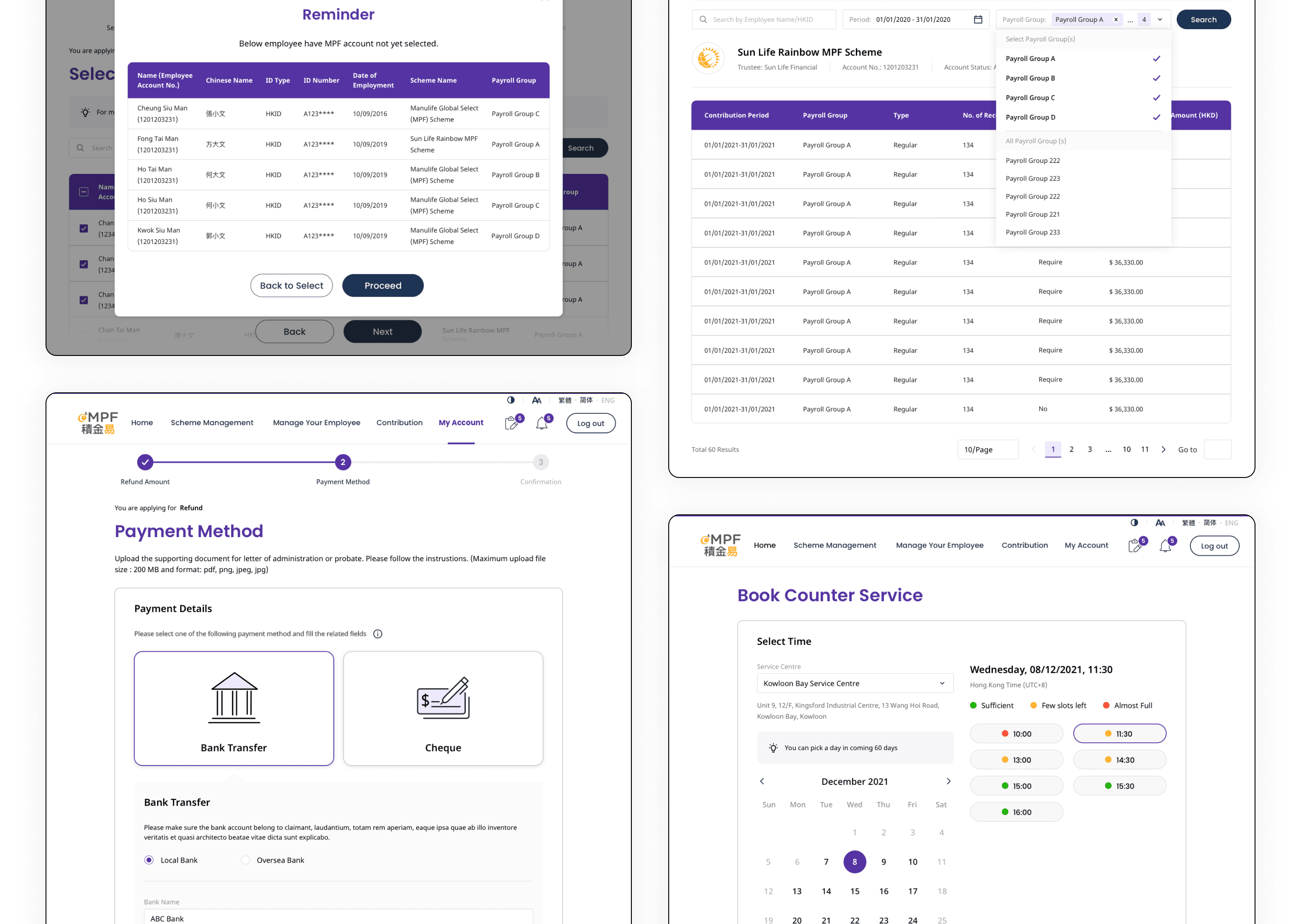
Employer Experience
For the employer role, we selected purple as the main color scheme to convey elegance, maturity, wisdom, ambition, and power, aligning with the employer's role. Purple contrasts strongly with orange, creating a visually distinctive and cohesive design.
The employer platform includes 23 modules, which are more complex than the employee flows. These flows cover data consolidation into tables, termination, enrolled scheme management, employee management, user management, employee enrollment, scheme enrollment, and contributions. Given the volume of data, filter functions and sorting are crucial for ease of use. Visual hierarchy is applied to manage complicated and repetitive fields, utilizing font weight and size to distribute similar data effectively.